Subscribe to our daily newsletter
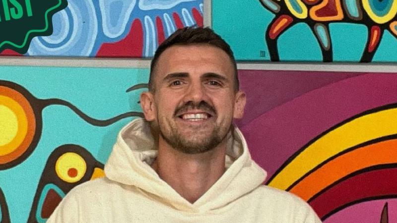
Chris Chipak (Submitted Photo/Chris Chipak)
RPCN Artist

‘Felt like a movie’: Chris Chipak making waves in the art world

Nov 18, 2024 | 5:34 PM

How Chris Chipak came to make a logo for the Saskatchewan Roughriders started with a simple message on his Instagram page.

“It was an initiative by the Canadian Football League to have Indigenous-themed logos throughout their whole organization,” he said.

“An artist got selected in every province pretty much to design the team logo.”

Although the artist now lives in Saskatoon, he spent the majority of his life in Red Pheasant Cree Nation and earlier this year, took part in a month-long art challenge hosted by his home nation. His version of the RPCN logo got the notice of leadership and was printed on shirts for the youth.
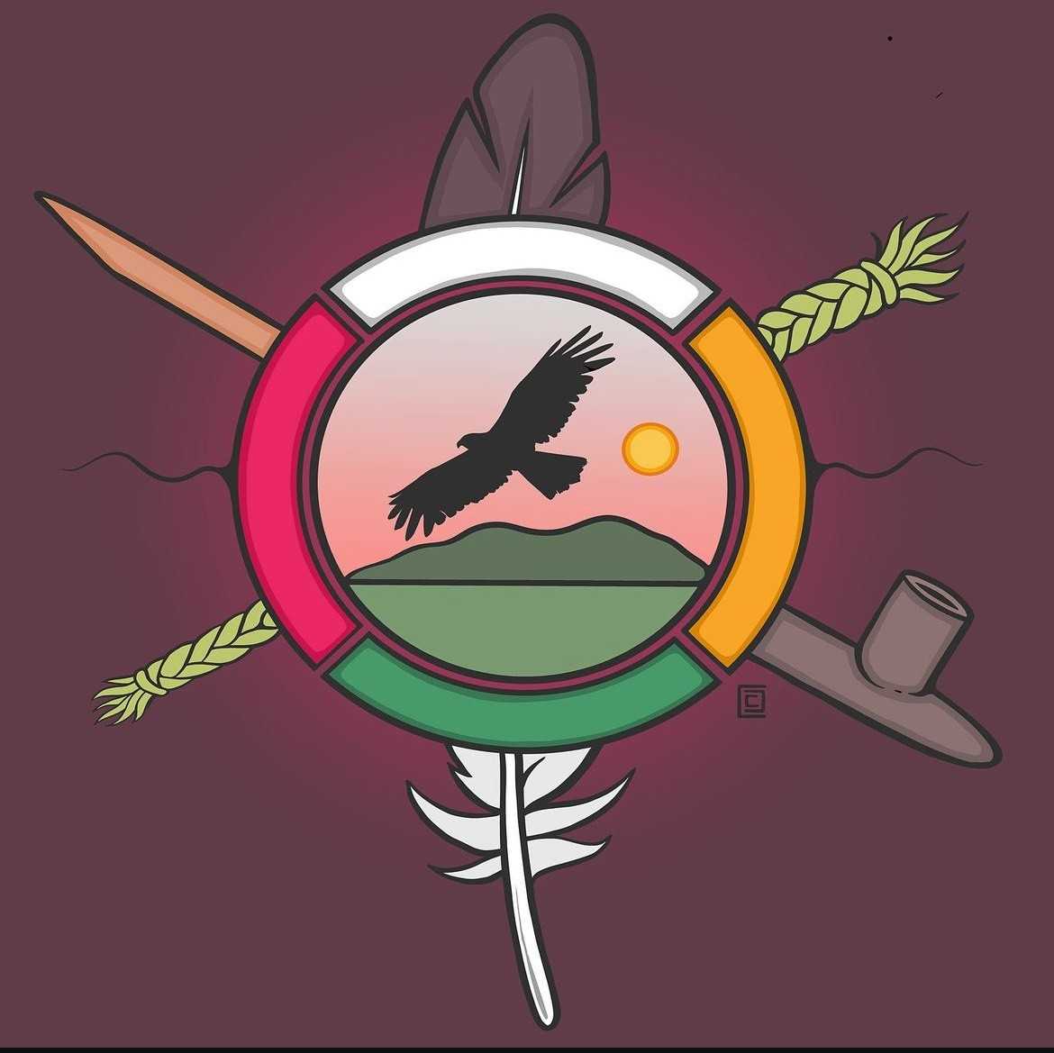
Chris Chipak’s interpretation of the RPCN logo. (submitted photo/Chris Chipak)

“We are proud of our Red Pheasant Cree Nation band member, Chris Chipak,” said Chief Cody Benson via email.

“The new logo is an update on our older logo and it has brought great pride to our community to work with such an accomplished artist.”

When the Riders reached out, they were enthusiastic about the potential collaboration and said they would love for him to sketch a potential design.

The CFL organization told Chipak they reached out to other artists and were on a time crunch as the National Day for Truth and Reconciliation was fast approaching. BattlefordsNOW has reached out to the Riders and the CFL but have not yet received a response.

“I replied really quickly,” he said, asking for “a day or two” to come up with an idea.

From there, he went to work and created a design that was pretty close to the finished product. The rules were the artists couldn’t change the design layout so, the S and the shield couldn’t move but elements within could.

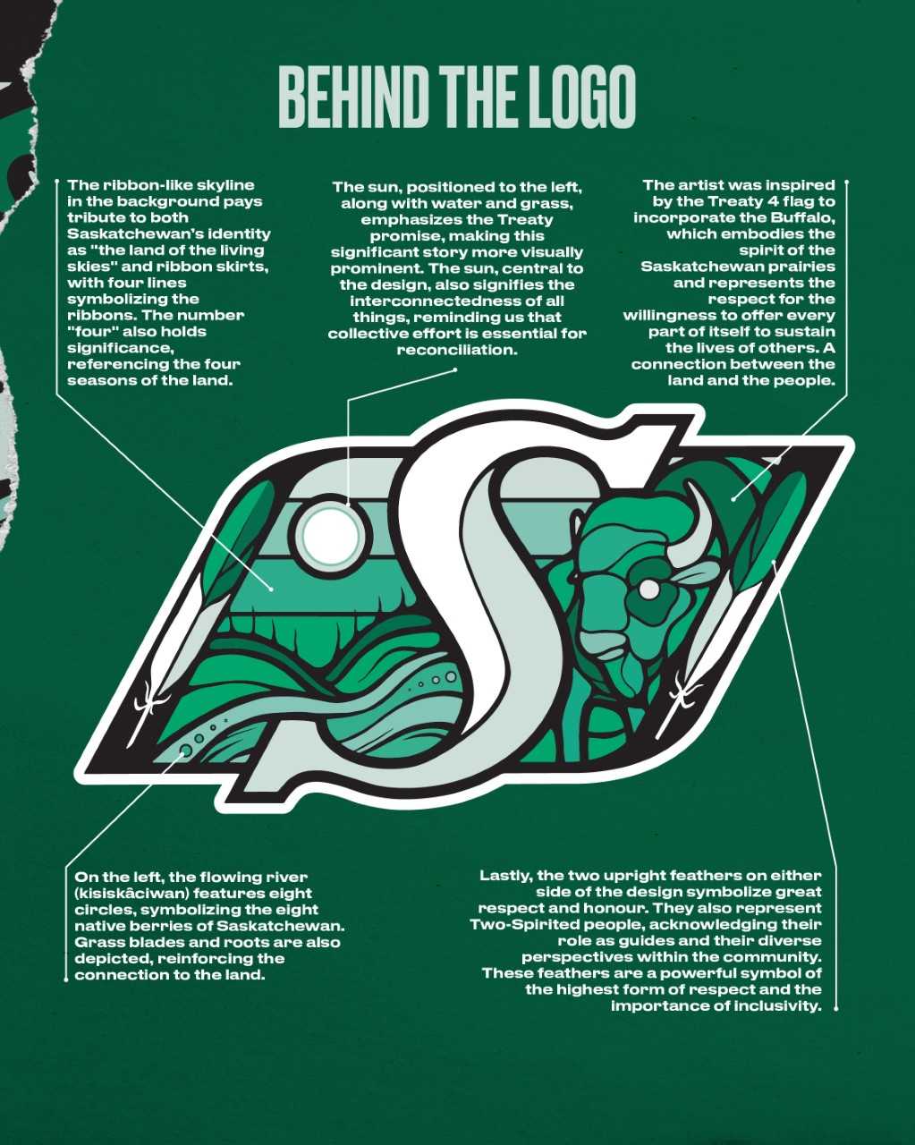
“I created a story on either side of the S where I had the buffalo, which represents the
Prairies and not just singularly focusing on Regina; it focused on all of us here in Saskatchewan,” he said.

“Rider Nation is such a huge…it’s just such a strong prideful organization.”

On the other side, he acknowledged the Treaty promise: “As long as the sun shines, the river flows and the grass grows, that we need to share this land.”

He said putting that in on both sides of the S tied in the shield. Meanwhile, he replaced the wheat stalks the shield usually carries with a feather on each side to represent two-spirited people and purpose that comes from a life of dedication.

Then Chipak submitted the initial black and white design.

“Within a day or two, they responded back and said they were going to move forward and show it to a committee of elders and knowledge keepers around that area,” he said.

Benson said Chipak’s work with the team was “exceptional.”

“We are blown away by all the talent that our members possess,” he said.

“His story and his accomplishments bring hope to the youth of our community and show that there are no boundaries to what they can accomplish.”

Meanwhile, once everything was approved, the artist started the next stage in the creative process.

The new Indigenous logo and explanations for the Saskatchewan Roughriders. (Graphic/Saskatchewan Roughriders)

“I coloured it super colourful and they were just like, ‘It is beautiful, but we wanted it in only four shades of green.”

Chipak said that was a challenge.

“I just kept working away and chipping away and sure enough, it made sense to me and throwing a green buffalo and a skyline of three different shades of green, it kind of came together pretty good.”

The work was featured on the players’ helmets just before Orange Shirt Day this year. Once the new logo was unveiled, he was invited to the game on September 28 in Regina where he was given the VIP treatment.

“It was an unreal experience…amazing opportunity and one of the top opportunities in my life that I’ve had,” he said, noting he still has moments when he couldn’t believe he was in the conference room.

“I’m forever grateful for how they’ve treated me,” he said.

“It felt like a movie, everything was just so bright and colourful and the crowd was wild. It was really good.”

julia.lovettsquires@pattisonmedia.com

On X: jls194864

View Comments